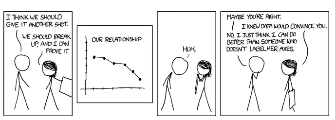
It might seem like a strange topic to write a post about. But, its something that needs to be talked about. It has many contexts, but the one I chose for today is how the statistical graphs, pie charts, bar graphs that are meant crunch the data in a viewer-friendly manner are often used to deceive us in to believing whatever suits the day’s agenda.
One common way to spread a completely different message than the actual one is to play around with y-axis(horizontal axis). One way is to start the y-axis from just around the least number in the data and then increment it unequally or at a very small rate such that the biggest value in the data looks visually quite high. Take a look at the image below :
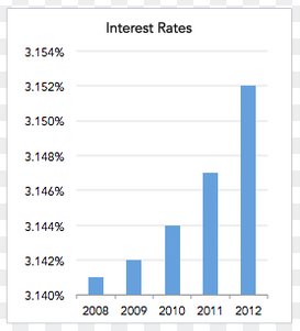
This seems to be an attempt to convince the viewers that interest rates have been increasing sky-fold every year or so. Notice that the y-axis starts at 3.140 and then increments at a rate of 0.002, which is clearly quite small compared to the starting value. This presents a skewed visual, good enough to sway the public opinion of people who let their guard down. If the above graph was to be adjusted to the correct way, it turns out to be something like this :
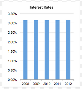
The correct graph shows that the interest rates haven’t increased as drastically as they were being showed in the previous graph. One could say that have remained fairly constant.
Another excellent example is that of a graph revealing the “truth of hike in petroleum prices”. I am puzzled !

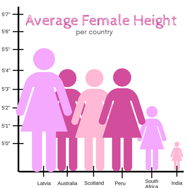
Take this too, will y’all ? Note that a difference of 5 inches can be graphically tweaked to deliver such a result ! The y-axis starts at 5 feet and increments at a rate of 1 inch only to produce such a graph.
Take this example of a pie chart depicting the results of 2012 Presidential Elections from the ever controversial: The Fox News.
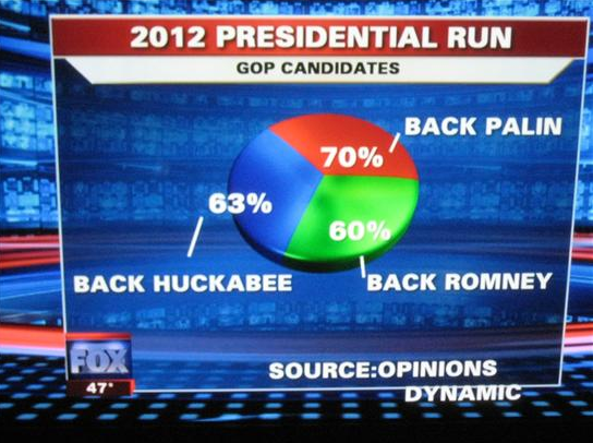
The problem with this one is that a pie chart should be used only to depict parts of a whole and all the parts must add upto 100%.
Another example with correct adding up of percentages but wrong visuals. (because a picture says a lot more than words ?)
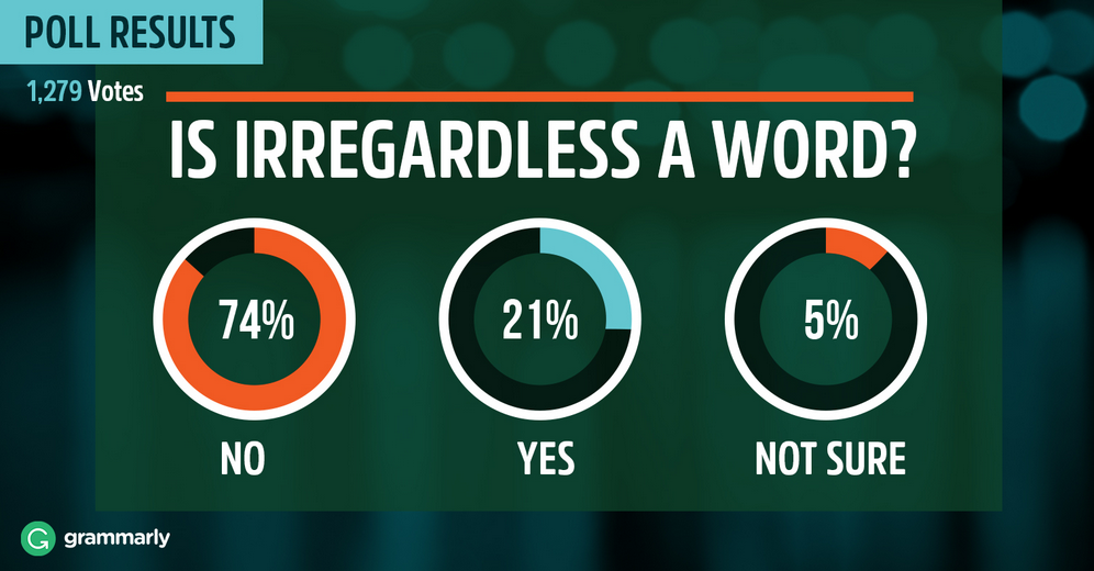
The above graph shows 74% as greater than 3/4 of the total area, 21% greater than 1/4 of the area and 5% almost tending to 15% mark.
Another bad representation combined with crappy labelling of the data :
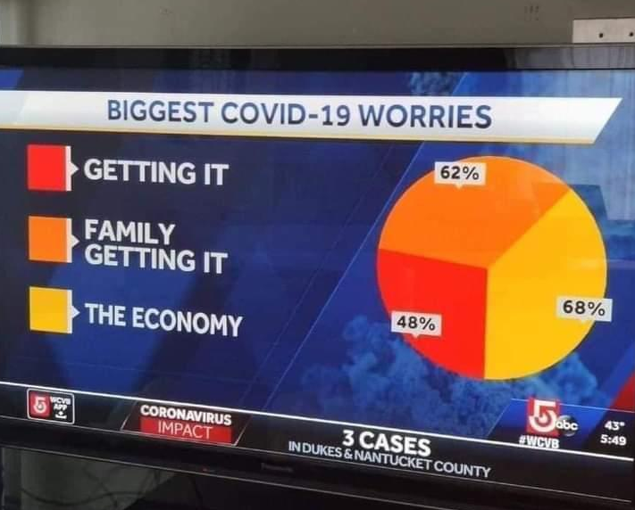
A very common example is YouTube asking for users’ feedback on their services where none of the options have a negative opinion. The worst you can vote is “Not good”

I could go on and on with more examples, but gotta keep this short.
Before finishing up, let’s get down to key lessons :
- In case of bar graphs, always observe the scale of both the axes before making any conclusions.
- In case a pie chart is shown, remember that all the parts should add upto 100% and all the parts should be of a whole i.e all the sub-fields should represent parts of a whole quantity.
- Never trust the graphs with double axes, one one each side. More often than not, they are intended to confuse and conclude something that doesn’t really exist.
- Finally, apply common sense and intuition before making up any judgements/conclusions from data.